3 Ideas for a Cafe and Coffee Website Design
As someone who LOVES to find new cafes to visit, this blog was very exciting for me to write. I go to a lot of cafe websites, and see a lot of things that drew me in and a lot of things that didn't pique my interest.
Here are some ideas that will have someone like me pack my purse, get in my car, and take a LONG drive just to taste one of your delicious caffeine beverages and sit in your shop.
1: Lean Into Your Quirks!
I've seen it time and time again, cafe and coffee shop websites sporting a brown and beige theme. It makes perfect sense: coffee is brown, so the website is brown. But that doesn't mean it's your only option (or should be your only option)!
Remember: following a trend will make you blend in. And if you have a website, you want to stand out.
So, if you want your website to make a strong impression, you have to be unique! Here's my suggestion: lean into your quirks and have that influence your design.
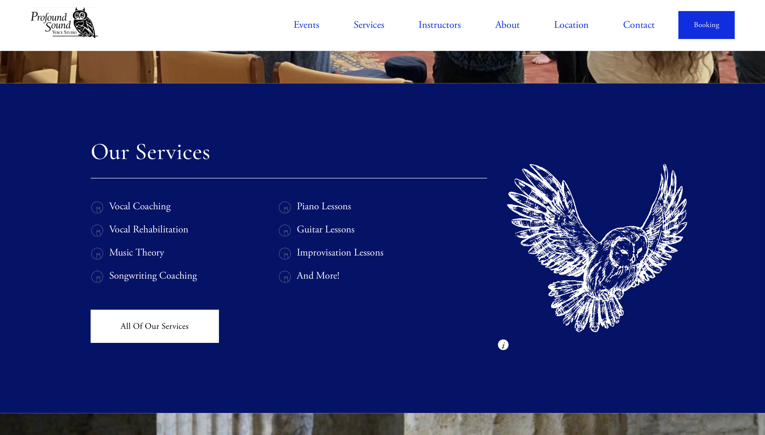
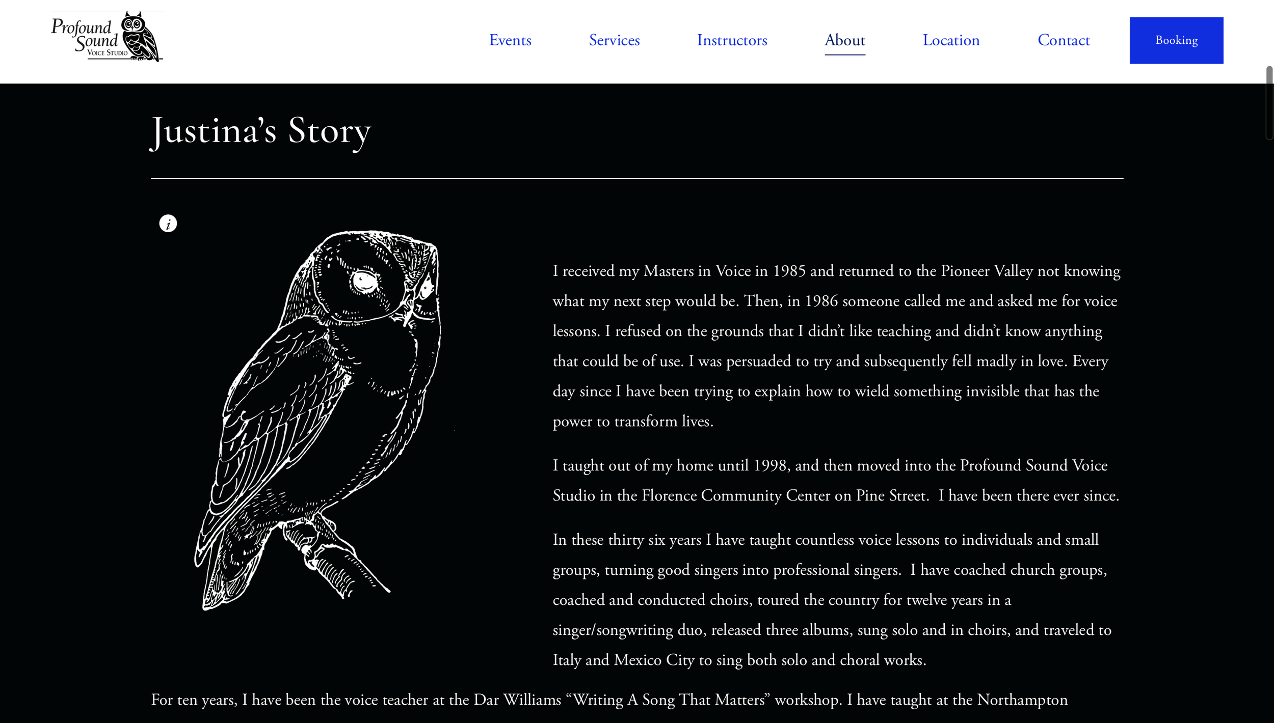
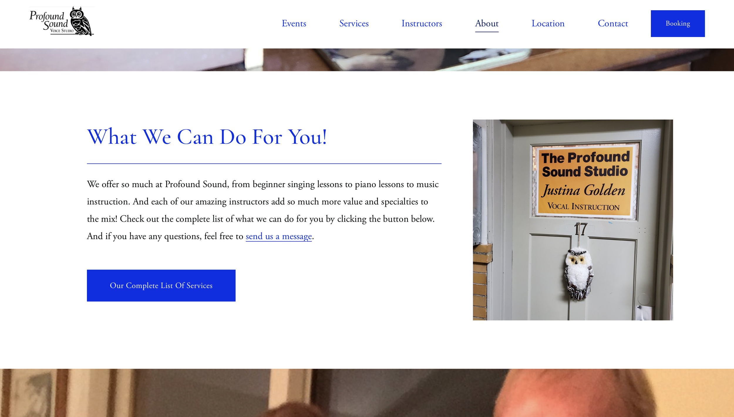
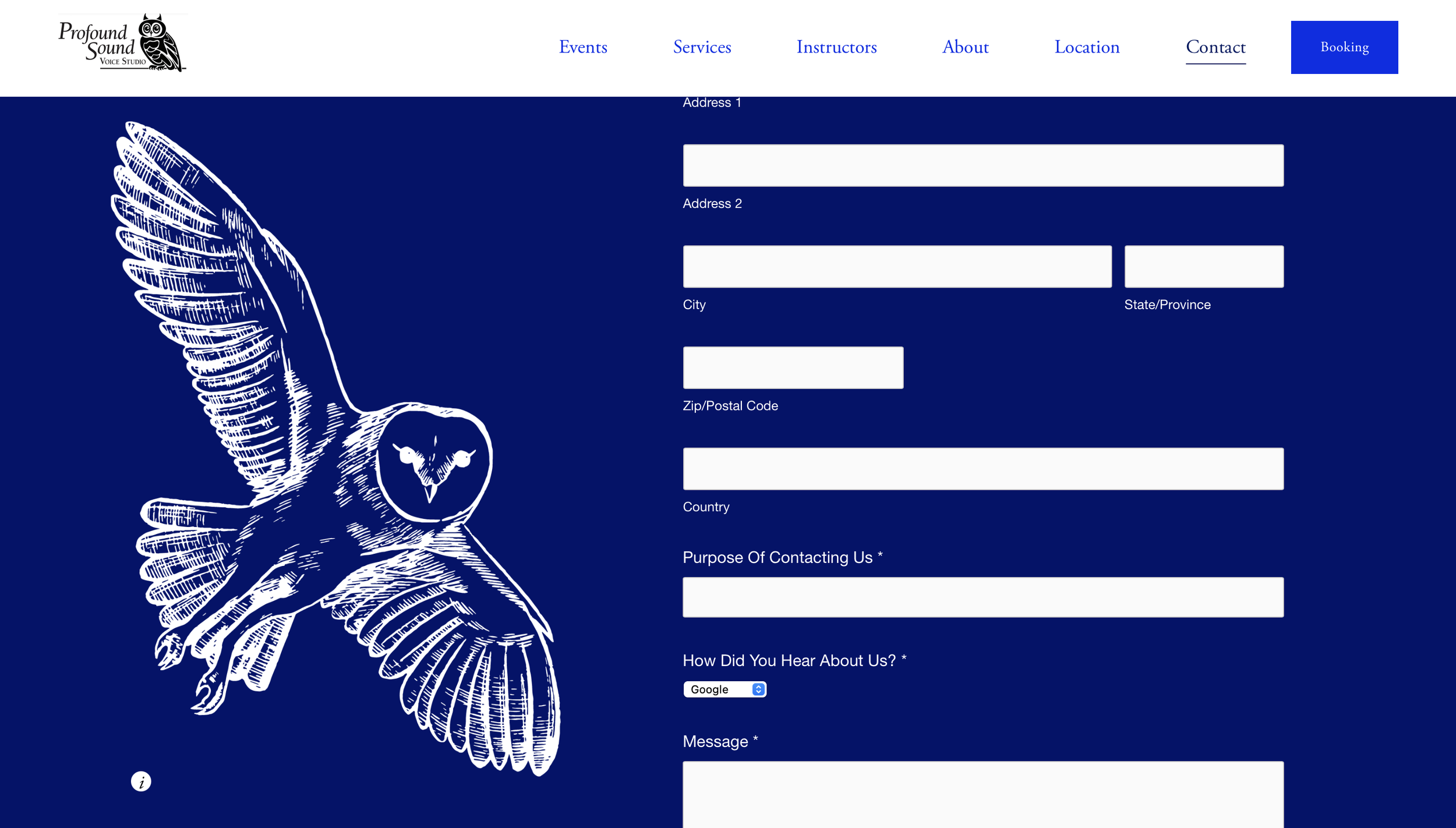
For example, we recently worked with an AMAZING client who teaches people how to sing. It would have been easy for her to suggest that we use music note iconography all over her website, but instead she suggested owl iconography. Why? Because she loves owls!
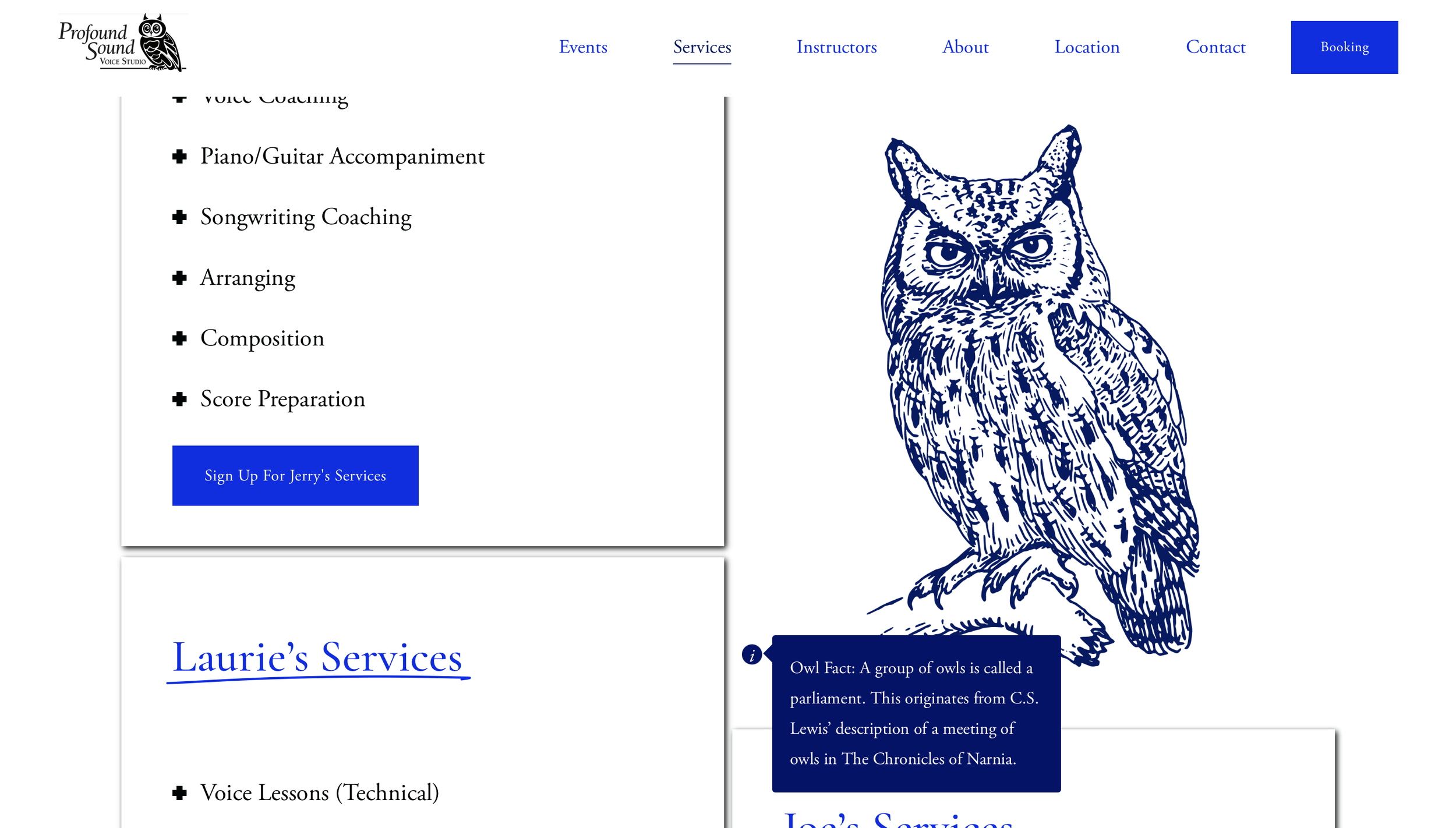
We ended up adding owl facts to her website, which made it a much more fun and interesting place to visit. Visit her website here.
And if you don't know what your quirks are, here are some questions that will help you discover them:
What is something unique about your location?
What is something unique about your shop?
What is something unique about your coffee beans?
What is something unique about your work uniforms?
What is something that YOU love to do?
2: Give Your Beans A Spotlight!
Your pastries and drinks are the real stars of your shop! So they deserve to have a place to shine on your website. Create a page that is all about the coffee beans that you use to create your delicious beverages.
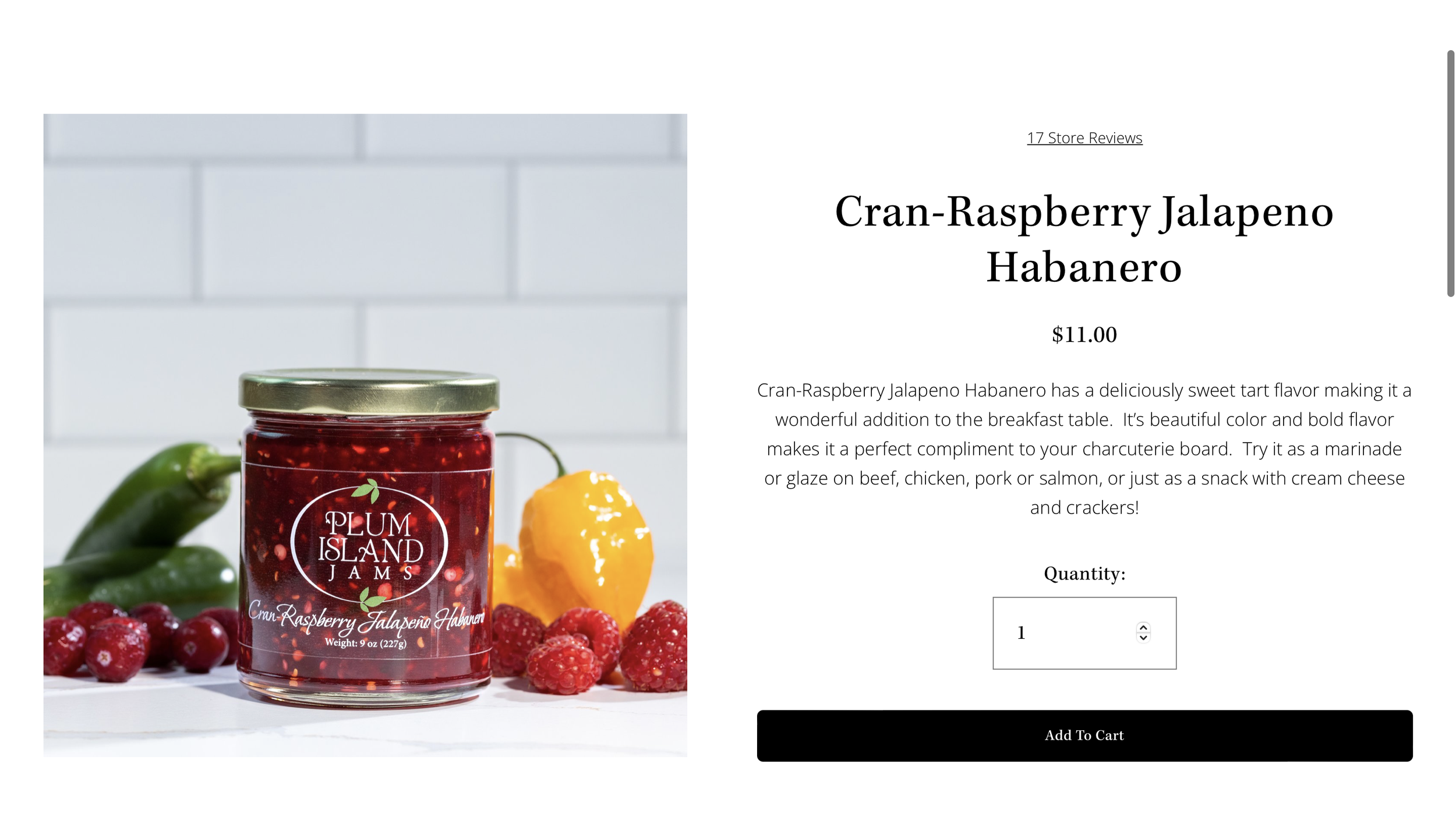
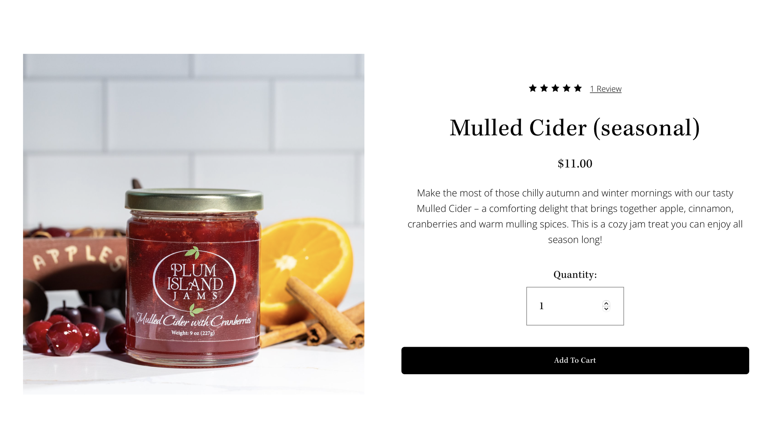
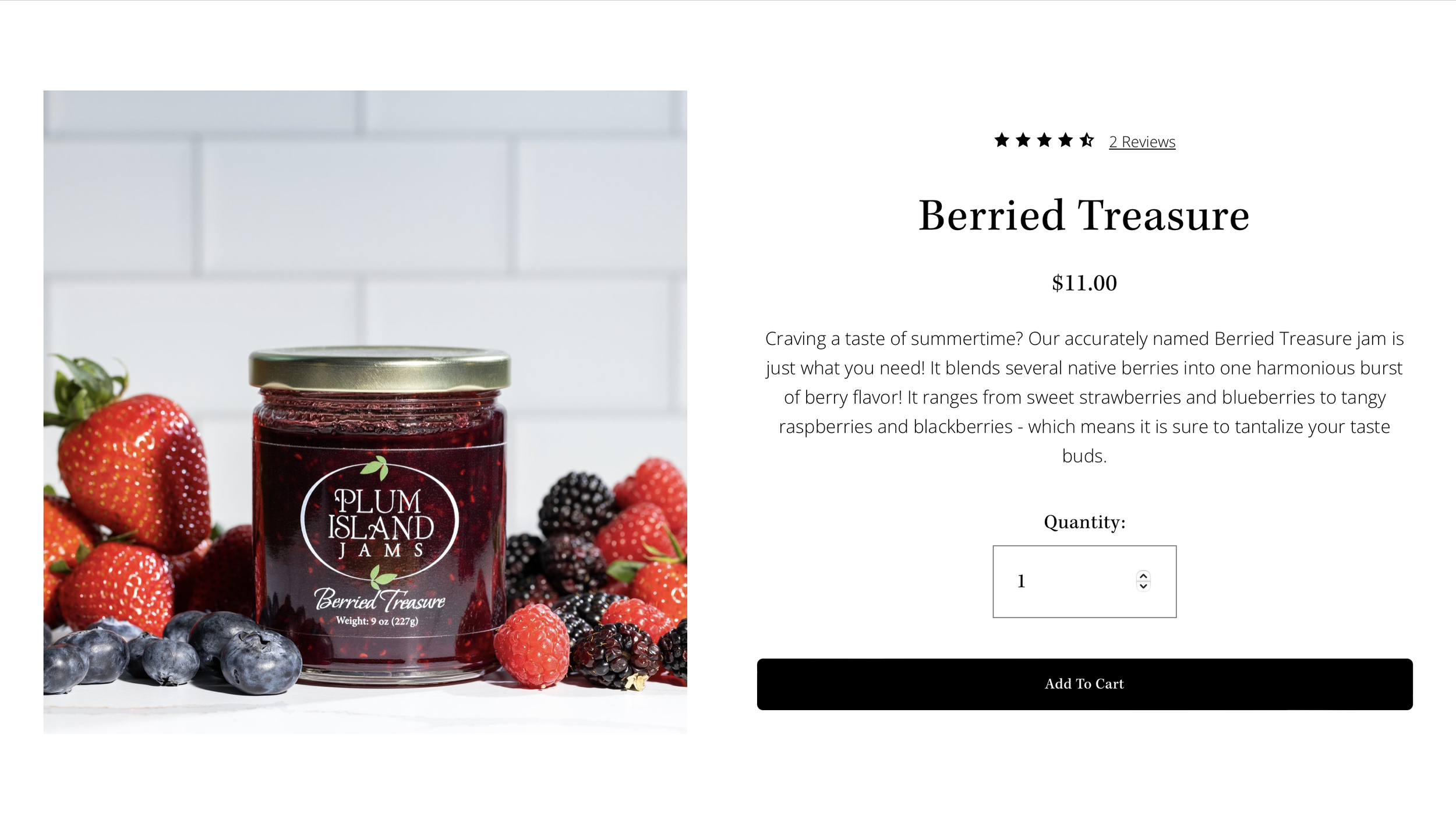
Include pictures of your beans and a little blurb under each of them about why you love them and why you think people should try them. Your excitement about your coffee beans will rub off on your website visitors, making them excited to try them!
I for sure felt this excitement while I was working on a client's website, and she had a description for each of her jams and jellies. I could feel her excitement about her products, and couldn't resist feeling excited myself. And when I showed my family what she offers, they got excited to try some, too!
Here are some questions you can ask yourself about your coffee beans to inspire your descriptions:
What does it taste like?
Where is it from?
What is unique about the flavor?
How did you find it?
3: Let's See Your Shop!
Your cafe and coffee shop is part of the attraction. People love to sit in cafes and relax or catch up with their friends. So to bring that crowd to you, you have to show your atmosphere on your website.
Include pictures of your tables, your coffee makers, your pastry selection, your window, and maybe even yourself!
Make your shop look as warm and welcoming as possible, so that people will feel welcome to visit.
This Is Just The Beginning
These ideas are just the beginning. There is a lot that goes into creating a powerful, effective website that really encourages people to visit your shop and make a purchase. And we have all the tools necessary to make your cafe shine.
Click here to request our help with building your website.
Click here to join our learning library and take our website maintenance course!


